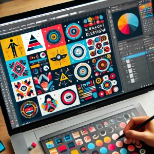


Brand icons are a key element of visual identity, helping to convey the brand’s personality and make it easily recognizable. Adobe Illustrator is the go-to tool for designing scalable and professional brand icons. This guide will show you how to create a set of cohesive and impactful icons.
1. Define the Purpose of the Icons
Understand how the icons will be used within the brand’s identity.
Questions to Ask:
- Are the icons for digital interfaces, print, or packaging?
- Should the icons be minimal, playful, or detailed?
- Will the icons be used individually or as a set?
2. Set Up the Canvas
Prepare a workspace for designing multiple icons.
Settings:
- Size: 512×512 px per icon (standard size for web use)
- Use artboards for each icon in the set.
- Color Mode: RGB for digital, CMYK for print.
3. Use Simple Geometric Shapes
Build icons with clean, simple shapes for a cohesive look.
How to Start:
- Use the Rectangle Tool (M) and Ellipse Tool (L) for base shapes.
- Apply the Shape Builder Tool (Shift + M) to combine or subtract elements.
- Keep shapes aligned using Smart Guides (Ctrl+U).
4. Maintain Consistency
Ensure that all icons follow the same design language.
Tips:
- Use a consistent stroke weight and corner radius.
- Stick to a uniform color palette.
- Align all icons to the same grid size.
5. Add Brand-Specific Details
Incorporate elements that tie the icons to the brand.
Ideas:
- Use the brand’s official colors and fonts.
- Add small details like patterns or symbols that reflect the brand identity.
- Ensure the icons match the tone of the brand (formal, fun, modern).
6. Test Scalability
Check how the icons look at different sizes.
How to Test:
- Scale icons down to 16×16 px to ensure legibility.
- Test icons at larger sizes (e.g., 1024×1024 px) for print use.
- Simplify details if they are too complex at smaller sizes.
7. Apply Colors and Effects
Style the icons with the brand’s color palette and subtle effects.
Options:
- Flat colors for a minimalist look.
- Gradients for depth and modernity.
- Use shadows sparingly to maintain simplicity.
8. Organize the Icon Set
Arrange the icons into a structured set for easy use.
How to Apply:
- Group icons by category (e.g., social media, navigation).
- Label each icon artboard clearly.
- Use consistent spacing between icons.
9. Export the Icons
Prepare the icons in multiple formats for various uses.
Export Options:
- SVG for scalable vector graphics.
- PNG for web with transparent backgrounds.
- AI or EPS for editable files.
10. Deliver an Icon Guide
Create a mini guide on how to use the icons.
What to Include:
- Color variations (e.g., light and dark backgrounds).
- Do’s and don’ts for icon usage.
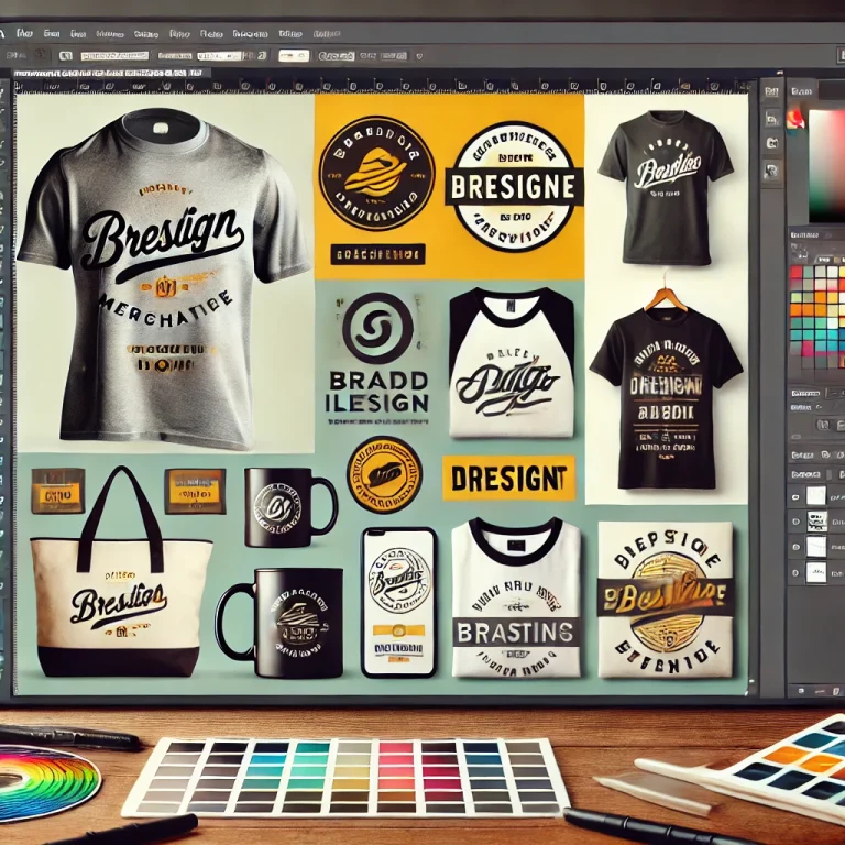
- Examples of icons applied in branding.
Conclusion
Designing brand icons in Adobe Illustrator allows you to create cohesive and professional visuals that enhance the brand’s identity. By focusing on simplicity, consistency, and scalability, you can deliver an icon set that is both functional and aesthetically aligned with the brand.


+ There are no comments
Add yours